A color model is a system of describing colors as three or four color values or components (i.e. RGB, XYZ, and CMYK). A color space is a specific implementation of a color model that defines a particular set of colors. There are many defined and device-specific color spaces that use each color model.
Human color perception cannot be fully defined by only two values, just as different geographic locations and the shape of the earth cannot be fully defined by a flat two-dimensional map, although flat maps are extremely useful. Different 3D color models and 3D color spaces are arbitrary methods that have been agreed upon to describe the three-dimensional aspect of human vision. Different 2D chromaticity diagrams (color maps) show two dimensions of a three-dimensional color space. Different types of flat maps and different types of flat chromaticity diagrams both serve different useful functions.
Human color vision is based on the three types of retinal energy detectors, called cones, which respond to different energy wavelengths corresponding to red, green, and blue light (the primary colors of light). The three color space values for a color represent how much each cone is stimulated by that perceived color. The three color values can be red, green, and blue values, directly representing the stimulus values of the three retinal cones (RGB 3D color model). The RGB color model relates directly to physical RGB devices, such as displays. Or, the three RGB color values can be transformed into a different set of three values (another 3D color model), to standardize or measure other color spaces.
In 1931, the International Commission on Illumination (CIE) adopted a new 3D XYZ color model, a new 3D Yxy color space based on the XYZ color model, and a 2D representation of the 3D Yxy color space, the 1931 CIE xy chromaticity diagram (Fig. 1).
Figure 1: The CIE 1931 xy chromaticity diagram, outlining the reference color gamut for the HDTV BT.709 standard.
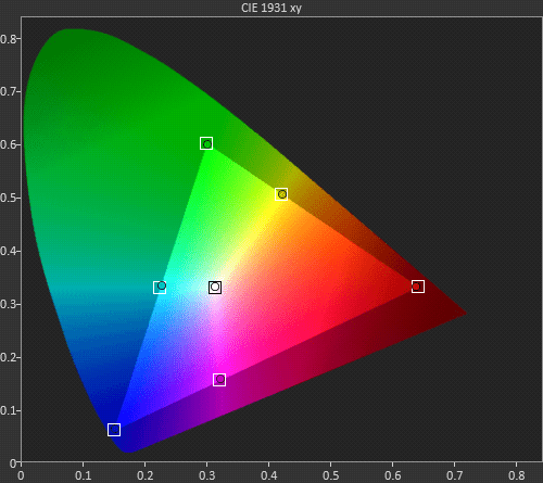
The Calman Color Gamut chart, which reproduces the CIE Chromaticity Diagram, shows a display’s measured primary and secondary colors and indicates the accuracy of those colors, compared to a reference standard (e.g. BT.709). All colors of light that a display produces are made up of some combination of the display’s Red, Green, and Blue primary colors, in varying proportions and intensities. Equal amounts of two primary colors, without the third primary, produces the secondary colors: Cyan, Magenta, and Yellow.
- Cyan – Blue and Green
- Magenta – Blue and Red
- Yellow – Red and Green
A display’s color gamut, the range of colors the display is able to reproduce, is graphically defined on the chromaticity diagram by a triangle that connects the display’s primary colors. Each square box is a color reference target – where the color should be on the diagram, according to the selected reference. Each colored dot indicates the display’s value for that color, according to the display measurements. The distance from the center white point indicates each color’s saturation, with zero saturation at the white point and target saturation in each square target box. Rotation around the center point indicates a change of hue, with the target hue in each square target box.
CIE Chromaticity Diagrams
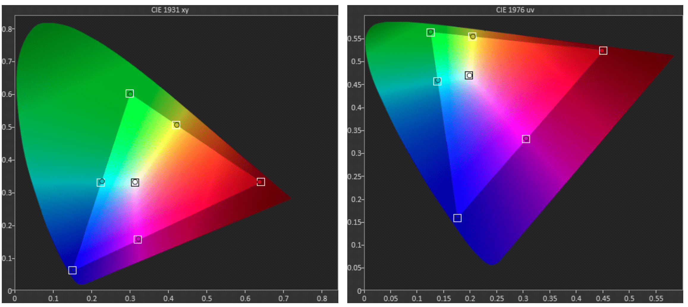
The original 1931 CIE xy chromaticity diagram quantifies the color of light independent of the intensity of light present, but it is not perceptually uniform. Equal distances on the diagram, in either the x or the y direction, do not represent color differences that are perceptually equal to human vision. In 1976 the CIE adopted an updated LUV color space and an associated u’v’ chromaticity diagram (usually indicated as simply uv), to address this lack of perceptual uniformity. The CIE 1976 LUV color space is called a Uniform Color Space (UCS) because it displays colors more uniformly according to human perception.
Comparing the 1976 uv chromaticity diagram to the CIE 1931 xy chromaticity diagram (Fig. 2) highlights how imperfect the original xy chromaticity diagram was in representing the human perception of color differences. Since the human visual system is much more sensitive to differences in shades of blue than either red or green, the blue region is much larger than the red or green region on the CIE 1976 uv chromaticity diagram. Likewise, humans are far more sensitive to differences in shades of red than green, so red is the second largest color region.
Figure 2: The area of each color region varies significantly, depending upon which CIE chromaticity diagram is selected (CIE 1931 xy on the left; CIE 1976 uv on the right).
The CIE also adopted a LAB color space in 1976, with a* and b* chromaticity parameters, but with no defined chromaticity diagram color regions. The CIELAB color space is based on the color-opponent theory of human vision, which theorizes that the mutually exclusive color qualities of red-green,yellow-blue, and white-black are due to neural processing of the retinal cone signals in a manner that fundamentally influences human color perception. The CIELAB L* lightness parameter closely correlates to perceived brightness.
Calman CIE Gamut Chart Options:
Calman provides three display options for the Gamut Chart:
- CIE 1931 xy
- The 1931 CIE Chromaticity Diagram; the more common version.
- CIE 1976 uv
- A more perceptually uniform chromaticity diagram that is beginning to be used more often.
- CIE 1976 a*b*
- Perceptually uniform color differences and L* lightness parameter has a better correlation to perceived brightness.
Note: The difference between a*b* (defined in the 1976 CIELAB color space) and u’v’ (defined in the 1976 CIELUV color space) is that a*b* is essentially u’v’ scaled up or down by L*.
While the improved visual uniformity of the uv chromaticity diagram is more technically informative, the 1931 CIE xy chromaticity diagram is still the prevailing industry method of specifying color coordinates, long after the introduction of the 1976 CIE uv chromaticity diagram (accuracy specifications for laboratory-grade spectrophotometers are still quoted in terms of xy).
When you are evaluating the results of standard display calibration, you may want to use the CIE 1931 xy chromaticity diagram for legacy comparison purposes. When you are analyzing a display’s 3D color space performance, or creating 3D calibration correction tables, you will probably want to use the CIE 1976 uv chromaticity diagram, for its more accurate representation of color difference perception.
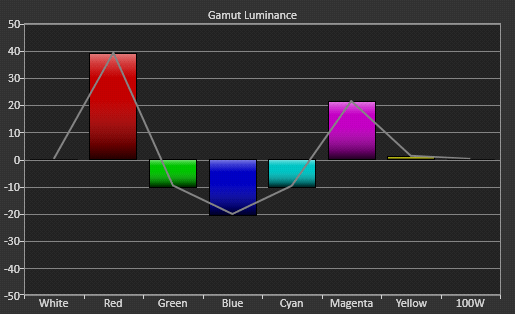
Gamut Luminance
In video displays, Y’CbCr values are transformed into R’G’B’ values. The Y’ luma component approximates the brightness information while the Cb and Cr chroma components approximate the color information. The relationship between Y’ and R’G’B’ values in the HDTV BT.709 color space is as follows:
Note: The ‘ prime symbols indicate that values are gamma encoded.
HDTV Y’ = 0.2126 R’ + 0.7152 G’ + 0.0722 B’
If a display reproduces a color either brighter or darker than the standard value, the color will appear, first of all, to be over or under saturated. The measured hue and saturation for each color is graphically indicated on the chromaticity diagram in the Color Gamut chart, but the chart doesn’t indicate luminance values. Calman provides a Gamut Luminance chart to indicate the luminance of each of a display’s primary and secondary color’s, relative to the reference luminance targets (Fig. 3). If the luminance of the primary and secondary colors are all correct, compared to the luminance of 100% white, the color bars on the Gamut Luminance chart will all be at the center target line.
Figure3: The Calman Gamut Luminance chart indicates whether the luminance of each of the primary and secondary colors is above or below the standard value for the selected reference gamut system.
Color Gamut Calibration
Some displays and video processors provide color gamut calibration controls, sometimes known as a Color Management System (CMS). A complete set of CMS color gamut display controls includes Hue, Saturation, and Value (aka Intensity or Brightness) controls for each of the display’s primary and secondary colors. The Hue and Saturation control for each primary and secondary color can be adjusted while viewing the Color Gamut chart. The Value/Intensity/Brightness control for each primary and secondary color can be adjusted while viewing the Gamut Luminance chart.